
If you’re one of the folks who skips anything I write to do with sci-fi or messing around with creative photography and image manipulation, this is one of the posts you’ll want to skip. 😉
 I’m writing this on Tuesday and pre-posting it for Saturday while I’m at OEGE, to coincide with the airing of the Easter weekend Doctor Who special. The little image you see here is, as I said earlier in the week, a strong candidate for the cover artwork for a Doctor Who nonfiction book I’m writing (one of those “unlicensed, unauthorized” types). It’s not a CGI image (except for a wireframe TARDIS on the little scanner screen), and nothing here is a screengrab from an episode. It’s all miniature photography, shot on a table in my living room in the dead of night with two piece of lighting apparatus, color filters (for the aforementioned lights), and a halfway decent digital camera. And here’s how it was all put together.
The fun thing about the round-patterned “TARDIS wall” is that it’s not a wall at all; it’s two pieces of well-battered foam packing pieces that I’ve kept around for some time due to their conspicuously TARDIS-esque look. I simply sat the two pieces on top of a pair of open CD jewel cases, and put the light behind them; I shot the light both natural white (the light in this case being one of those nifty little light-with-a-built-in-tripod gadgets that you can get at Radio Shack for a few bucks) as well as with blue, orange and green light filters. Propped up against the back of the CD cases is our first contribution from Character Options, the makers of the Doctor Who action figures: this is the flimsy transparent lid from the Classic Dalek Collectors’ set released in 2008. I’ve kept it around, and it actually works out well that by the time I used it here, it had accumulated a healthy layer of dust! I remember all of fandom being so impressed that CO thought to emboss the lid with the seal of Rassilon from the classic series, and it just seemed too nifty to not use somehow. So, with the camera at “ground level” looking into this enclosed contraption, you get the image below right:
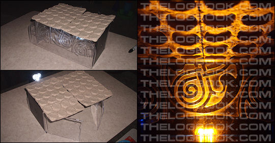
Flip that image on its side, and then copy, mirror and flip it, and you have two walls. I “fuzzed” the seal of Rassilon in the background to sharpen the focus on the next thing I’d be shooting.
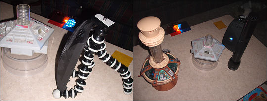
This part of the process was much more troublesome. I used the same lighting gear (now adding an LED light from the side whose colors could be changed with the touch of a button, propped up with a little flexi-tripod gadget that’s proven to be very handy for the weirdest stuff), and I even started messing around with doing bicolor lighting filters. The props here were the respective TARDIS consoles from the two wildly different playsets down through the years – handily similar in relative diameter (though they were intended for figures of vastly different scales), but very, very dissimilar in height. The Character Options TARDIS console is meant to rest in a “bowl” built into that playset, while the Dapol TARDIS console is meant to simply sit on a “floor” base. I had to improvise on the fly and find just the right material (i.e. the lid to a spindle of blank discs) that would raise the Dapol TARDIS to the same height without moving the camera at all. I originally dug out the giant flashlight with the idea of putting yet a third colored filter on it and using it as a light source; in the end, it was handier for blocking the actual glare of the LED lights from the camera. The clear components of each console caught the backlight, and we were off to the races:
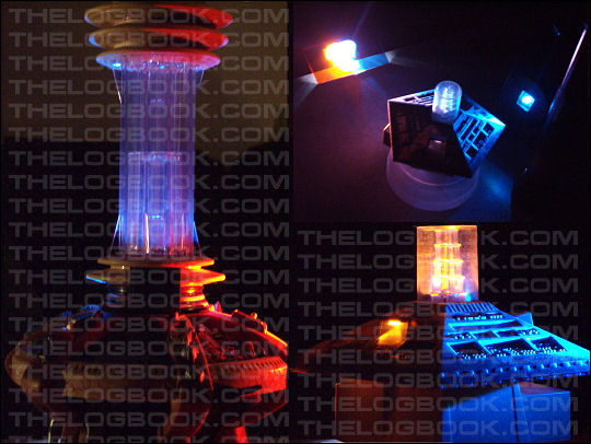
The rest was done in Paint Shop Pro, with a brief detour into 3D Studio Max to do the wireframe police box that’s “displayed” on the little screen near the center of the picture. I used PSP to simply “paint” a flipped relevant portion of the old console onto the new. I increased the brightness on a portion of the new console, tinted it green, and created a “glow” emanating from it, and then dropped a “glare” filter on the whole thing to unify the pasted-together image and get a little wild with the color. The results were then run through a couple of filters and effects to create a “drawn” look – like something you might get out of an upper-crust graphic novel.

(Everything’s watermarked so this doesn’t all wind up on the cover of someone else’s book first. 😛 )
I’m working on a back-cover variation that will be somewhat the reverse of what’s shown here…if that makes any sense. I realize that the final image here isn’t a photorealistic recreation of any particular TARDIS console room from Doctor Who…but that wasn’t the point. The point was to combine the old with the new, run it through a blender, puree it a bit, and see what comes out. The “walls” sort of split the difference between the evenly-spaced, organic-look walls of the new series TARDIS and the more obvious “roundels” of the old; the idea of the old TARDIS showing through the new is meant to be the same thing: the book’s intended to be, on at least one level, a guide to original-series Doctor Who for people who have only become fans by way of the new series. Long-running storylines will be pointed out, along with in-jokes, frequent flyers in the casting department, and so on. It’ll also cover Torchwood, Sarah Jane Adventures, Big Finish, and if it actually gets on the air this year, the K-9 series too.
My big worry? It might wind up being a huge freaking book. (The obvious fix there, of course, is that it may wind up becoming two or three huge freaking books. Stay tuned!)


+ There are no comments
Add yours